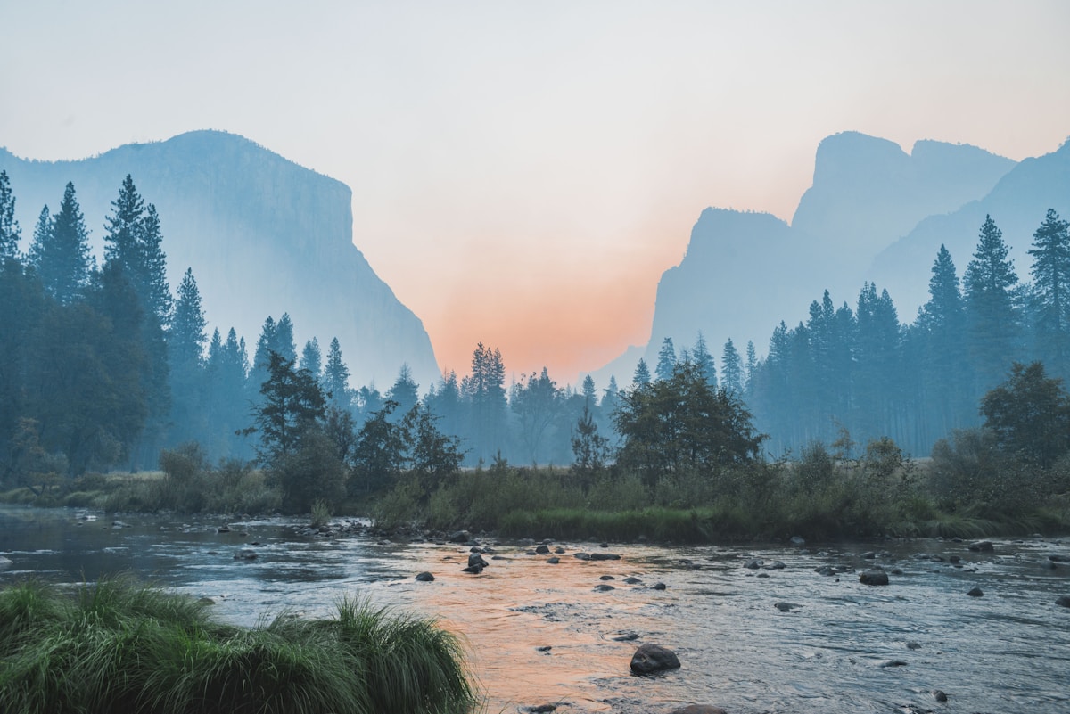
Testing Image Directives
This note exists to exercise every variant of the ::image directive so we can see what works and what needs tuning.
Block Image with Caption (simplest)
Just an image with a caption. No float, full width, caption on bottom.

Some text after the image to verify spacing.
Floated Right with Source Attribution
This paragraph should wrap around the floated image on the right. The image takes up 40% of the content column by default, leaving 60% for this text to flow beside it. The caption should automatically appear on the left side of the figure, and the source attribution should sit at the bottom.

Lorem ipsum dolor sit amet, consectetur adipiscing elit. Vestibulum ante ipsum primis in faucibus orci luctus et ultrices posuere cubilia curae. Sed vel sapien at nisi accumsan tincidunt. Praesent euismod, nisi vel consectetur interdum, nisl nisi aliquam enim, eget facilisis ante nisl vitae nisi. Nulla facilisi. Nullam euismod, nisi vel consectetur interdum.
Maecenas sed diam eget risus varius blandit sit amet non magna. Donec ullamcorper nulla non metus auctor fringilla. Duis mollis, est non commodo luctus, nisi erat porttitor ligula, eget lacinia odio sem nec elit.
Floated Left with Custom Width

This text wraps around the left-floated image. The image is set to 50% width instead of the default 40%, so there's a bit less room for text here. The caption should appear on the right side of the figure since the image is floated left.
Integer posuere erat a ante venenatis dapibus posuere velit aliquet. Cras mattis consectetur purus sit amet fermentum. Nullam id dolor id nibh ultricies vehicula ut id elit. Aenean lacinia bibendum nulla sed consectetur.
Block Image with Source (caption flips source to top)
When a block image has both a caption and a source, the source should flip to the top so they don't compete for the bottom position.
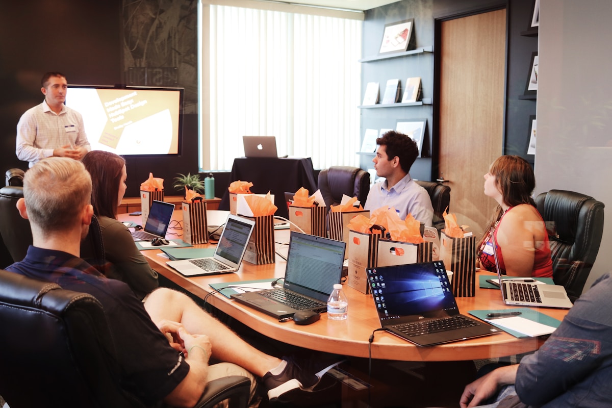
Tall Image with Max-Height
A tall, narrow image constrained by max-height to prevent it from dominating the page.
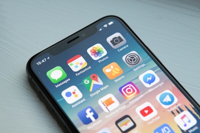
This demonstrates the max-height constraint. The image is tall and narrow (a mobile screenshot), so without max-height it would push everything else down. With max-height="400px", it scales down to fit within that vertical constraint while maintaining its aspect ratio.
Cras justo odio, dapibus ut facilisis in, egestas eget quam. Morbi leo risus, porta ac consectetur ac, vestibulum at eros. Praesent commodo cursus magna, vel scelerisque nisl consectetur et.
Custom Caption Width

This image has a longer caption that needs more room, so caption-width is set to 45% of the figure container (instead of the default 33%). The text beside the floated figure should still have enough room to be readable.
Standard Markdown Image (for comparison)
This is a regular markdown image — no directive, no caption, no float. Just for comparison.